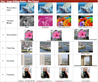
 For the first row of the contact sheet I dealt with resolution and DPI. The higher the resolution the clearer the picture is. To make things easier I found a picture on morguefile.com of a sailboat that was already 1200. I then downloaded it onto my desktop and then into photoshop. Once in Photoshop I went to image and image size to change the height of the picture to one inch. Then I changed the resolution from 1200 to 600 and placed the image in the correct spot and to 300 and 72. In between each I saved the image to the desktop and them pulled it into the contact sheet
For the second row I seleced an image with a lot of color. I then put my image of colorful flowers into photoshop where I went to view and found it was already in CMYK. I then changed it from CMYK to RGB. For Duotone I had to change it to greyscale and make sure that it was a pdf and not jpeg. I then changed one of the colors to bright pink. Black and white was easy because all I had to do was change it to greyscale and I was done.
For the third row I chose an image that was already longer than it was tall so that I could just use the original image as my portrait after changing the height to one inch. I then changed the dimensions of the images through the image size feature and made the image into a square and then portrait.
The fourth row was about zooming in and cropping the picture. I made the Picture one inch by one inch and put one and one in the height and width up top. I then cropped and clicked twice and the image automatically fixed itself.
For the fifth line I did pretty much the same thing, I just chose a picture that was less concrete and by the end of editing you do not know that it is a windowsill.
The sixth line was my favorite. I chose a red panda bear for no apparent reason other than it was a high resolution and a huge picture. It doesn't show the differences as much as I would like but it was sufficient so I stuck with it. I shrunk the picture down in photo shop to a one inch height and put the original i the first box or the "journalistic" box. I then went into filter and selected the different types of brush strokes I needed and inserted the image.
