Monday, November 23, 2009

New Leaf webpage


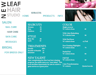
For the mock website my partner, Jessica Smith, did the main website for The New Leaf hair studio. I chose to do a second page off of that main page so I did hair the hair care page under the services tab. I decided to keep the New Leaf Hair studio logo in the same spot as the main page. I changed the color of the specific tab i was on and moved the tab services above the other tabs and hair care to the right of the other tabs. I thought that would make it easy for the user to know where to go and specifically what they are looking at. I kept the font consistent with the main page and made the main topics a bigger font. Everything is all caps besides the information under the categories. I thought this was a good idea because the categories liek color and hair cuts let the user pay attention to what they are specifically looking for, and the lowercase services listed underneath are easy to read.
The New Leaf Brochure


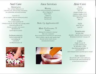
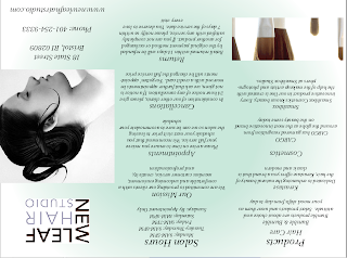
For the brochure my partner Jessica Smith and I decided to do a local spa. I did the inside pages that listed the nail care face services and hair care. In indesign we made the gradient a light shade of green and the other color white so the brochure made the spa seem fresh, clean, and relaxing. For our font we decided to use Utopia std for out font because it fit with the theme of relaxation at the spa and was also legible. I got down all the information and filled in the white space with pictures I had taken a screen shot off of of the New Leaf website. I put them into photoshop and clicked on duplicate layer to my brochure. I then moved them to where I wanted to be via the tool on the side.

Monday, November 2, 2009

Adele concert poster


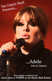
For my Concert poster I decided to do Adele. Adele is a very classic and neat kind of performer and I regret making that choice because my poster is plain. But if I had made it cluttered and crazier it would have clashed with the kind of music she makes. Her real world posters are very straight forward and simple so I figured I would go with that theme.

It was my first thought to make it black and white and leave her eyes green and her lips pink, but I couldn't find a way to do that and instead changed the image into an artistic brush stroke on photoshop.

I then put it into quark and found a unique but legible font and put the text over the picture.