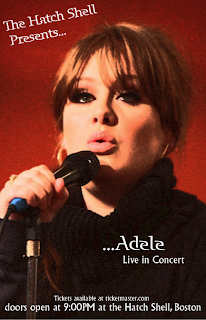
For my Concert poster I decided to do Adele. Adele is a very classic and neat kind of performer and I regret making that choice because my poster is plain. But if I had made it cluttered and crazier it would have clashed with the kind of music she makes. Her real world posters are very straight forward and simple so I figured I would go with that theme.
It was my first thought to make it black and white and leave her eyes green and her lips pink, but I couldn't find a way to do that and instead changed the image into an artistic brush stroke on photoshop.
I then put it into quark and found a unique but legible font and put the text over the picture.

No comments:
Post a Comment