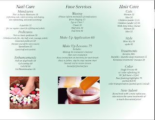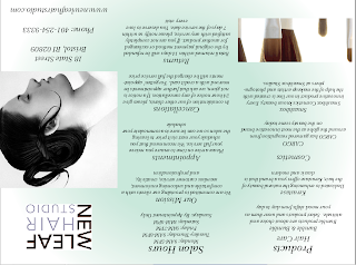

For the brochure my partner Jessica Smith and I decided to do a local spa. I did the inside pages that listed the nail care face services and hair care. In indesign we made the gradient a light shade of green and the other color white so the brochure made the spa seem fresh, clean, and relaxing. For our font we decided to use Utopia std for out font because it fit with the theme of relaxation at the spa and was also legible. I got down all the information and filled in the white space with pictures I had taken a screen shot off of of the New Leaf website. I put them into photoshop and clicked on duplicate layer to my brochure. I then moved them to where I wanted to be via the tool on the side.

No comments:
Post a Comment