Sunday, December 13, 2009
Monday, December 7, 2009
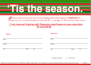
The top Bind and Blow card was made in quark. I started with the most tedious part which was the lines. I made individual rectangles and then pieced them together. It went faster than I had anticipated and was rather easy once i had figured out the colors to put in the swatches.
I used calibri size twelve for the red part underneath the lines. I used calibri size 8 for the Name, address, city, state, and zipcode and size six for the fine print at the bottom. The line tool was useful in quark and i used that to make the lines for the name and address part.
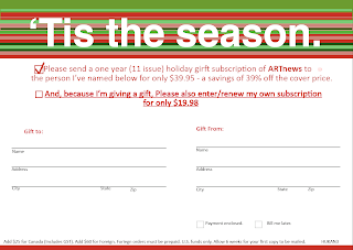
The bottom one was made in indesign. For whatever reason I seemed to find better colors to match up with my card on indesign. I basically did everything the same except that I didn't use the line tool for the lines. instead i just made texts boxs and clicked underline and made a line that way. The line tool was hard to use on indesign and got very frustrating because it would break as you expanded it and was almost impossible to get to be a straight line. for that reason I did the back of my bind and blow card on Quark.
Monday, November 23, 2009
New Leaf webpage
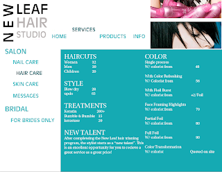
For the mock website my partner, Jessica Smith, did the main website for The New Leaf hair studio. I chose to do a second page off of that main page so I did hair the hair care page under the services tab. I decided to keep the New Leaf Hair studio logo in the same spot as the main page. I changed the color of the specific tab i was on and moved the tab services above the other tabs and hair care to the right of the other tabs. I thought that would make it easy for the user to know where to go and specifically what they are looking at. I kept the font consistent with the main page and made the main topics a bigger font. Everything is all caps besides the information under the categories. I thought this was a good idea because the categories liek color and hair cuts let the user pay attention to what they are specifically looking for, and the lowercase services listed underneath are easy to read.
The New Leaf Brochure
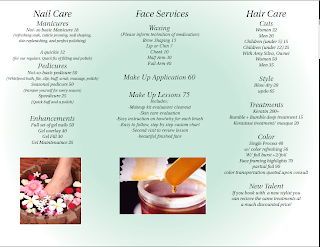
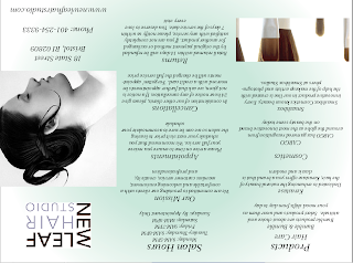
For the brochure my partner Jessica Smith and I decided to do a local spa. I did the inside pages that listed the nail care face services and hair care. In indesign we made the gradient a light shade of green and the other color white so the brochure made the spa seem fresh, clean, and relaxing. For our font we decided to use Utopia std for out font because it fit with the theme of relaxation at the spa and was also legible. I got down all the information and filled in the white space with pictures I had taken a screen shot off of of the New Leaf website. I put them into photoshop and clicked on duplicate layer to my brochure. I then moved them to where I wanted to be via the tool on the side.
Monday, November 2, 2009
Adele concert poster
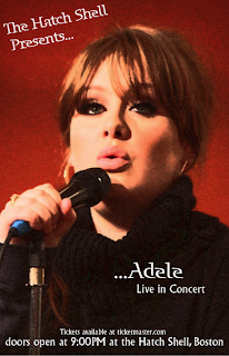
For my Concert poster I decided to do Adele. Adele is a very classic and neat kind of performer and I regret making that choice because my poster is plain. But if I had made it cluttered and crazier it would have clashed with the kind of music she makes. Her real world posters are very straight forward and simple so I figured I would go with that theme.
It was my first thought to make it black and white and leave her eyes green and her lips pink, but I couldn't find a way to do that and instead changed the image into an artistic brush stroke on photoshop.
I then put it into quark and found a unique but legible font and put the text over the picture.
Monday, October 19, 2009
Powerpoint design rational
For my powerpoint I was first going to do the spice girls, but I wanted to make it more dramatic so I changed my mind and did Lady Gaga, sorry professor Shiebler! I know you're not a fan.
For my first slide I chose a picture of Lady Gaga in animal print with a painted blue mark on her face. I tried to get my font color as close as possible to the blue on her face and used apple chancery for my font. I think it is a nice legible font, but it is also funky and girly like Lady Gaga.
For the second slide I chose a picture of Lady Gaga's profile with giant headphones on. She has bright pink lipstick on so keeping with the theme of the previous slide I tried to match the color of the font with her lipstick. I made the background black and had the facts come up in order around her head. I used calabri for font which is boring but safe and easy to read. since the facts were appearing and then dissapearing I wanted to choose a very easy on the eyes font so that people could read them fast and they wouldn't miss any of the facts.
For the third slide I chose the cover of "the fame" because it is bold and again made my background black. Again I chose lucida bright, an easy to read font because I wanted it to be easy to read so that I didn't have to spend much time on this slide because reading track names is kinda boring.
For the fifth slide I made a bad mistake by not making individual text boxes so that the facts and categories could come in one at a time. I should have redone this slide but other assignments and time didn't allow me to do so. I think I spent enough time on this slide so that everyone could at least read everything on the slide before it transitioned.
Saturday, October 3, 2009
video animation and collage
to make my collage I took screen shots of different parts of my body off of facebook. I then put then in photoshop and used the magnetic lasso tool to cut out parts of the picture I did not need. I then put the images of each part of my body and put them together in a way that looked real. I decided to put my collage of myself over a background of a sunset because it symbolizes serenity which reflects my quote.
To make my collage a movie I went to animation and used to tool at the bottom of the screen. I made sure the eye on the layers was on one layer at a time and made the seconds between each layer .5 . I then copy and pasted the collage onto the font poem, which was too small but I decided I liked it that way. I then saved it as a quicktime player video and put it onto my blog.
Thursday, October 1, 2009
Monday, September 21, 2009
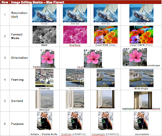 For the first row of the contact sheet I dealt with resolution and DPI. The higher the resolution the clearer the picture is. To make things easier I found a picture on morguefile.com of a sailboat that was already 1200. I then downloaded it onto my desktop and then into photoshop. Once in Photoshop I went to image and image size to change the height of the picture to one inch. Then I changed the resolution from 1200 to 600 and placed the image in the correct spot and to 300 and 72. In between each I saved the image to the desktop and them pulled it into the contact sheet
For the second row I seleced an image with a lot of color. I then put my image of colorful flowers into photoshop where I went to view and found it was already in CMYK. I then changed it from CMYK to RGB. For Duotone I had to change it to greyscale and make sure that it was a pdf and not jpeg. I then changed one of the colors to bright pink. Black and white was easy because all I had to do was change it to greyscale and I was done.
For the third row I chose an image that was already longer than it was tall so that I could just use the original image as my portrait after changing the height to one inch. I then changed the dimensions of the images through the image size feature and made the image into a square and then portrait.
The fourth row was about zooming in and cropping the picture. I made the Picture one inch by one inch and put one and one in the height and width up top. I then cropped and clicked twice and the image automatically fixed itself.
For the fifth line I did pretty much the same thing, I just chose a picture that was less concrete and by the end of editing you do not know that it is a windowsill.
The sixth line was my favorite. I chose a red panda bear for no apparent reason other than it was a high resolution and a huge picture. It doesn't show the differences as much as I would like but it was sufficient so I stuck with it. I shrunk the picture down in photo shop to a one inch height and put the original i the first box or the "journalistic" box. I then went into filter and selected the different types of brush strokes I needed and inserted the image.
Font Poem
For my font poem I came across a Dave Matthews Band quote that was about relaxing and not letting your worries get the best of you. I picked it because most of the time, I am stressed out about one thing or another and can get very flustered. Which is why the glichs in this class really get to me and I am so easily frustrated. When I get to a point that I am very frustrated it is difficult for me to take a step back and focus on what needs to be done. This quote reminds me to take time to take a deep breathe, and my worries are not as important as they may seem.
The Mac computer in the library that I am currently using will not let me open my font poem, even though I made my font poem on this exact same computer about a week ago. Therefore, I do not know exactly which fonts I used but I can recall in general what I did from memory. For the word "relax" I chose a cool color blue that reminds me of peacefulness and made it in the font that resembled what i looked like in that 80's song " Relax, don't do it" music video. For the words "trouble" and "worries" I thought a fire engine red would work because it is a color that symbolizes both anger and panic. For the word "weight" I chose a light gray to remind readers of a weight in a gym. I then manipulated the word in a way that made it look as though something was pulling it down so it looked heavy.
I didn't encounter too many problems with this assignment. I thought it was rather easy and a great way to introduce us to working with layers before we attempted our collage. I am most proud that I made it through an assignment without getting frustrated, mostly because the contact sheet was challenging for me.
If I had had more time I would have changed my quote all together. When I heard that we were going to make collages that had to do with our font poems I wanted to change my font poem all together to a quote by Mae West about never burning bridges and then do parts of my body from all the different sports I have done and maybe some from my graduation to symbolize where I have been and that I value all the friendships I have made.
Wednesday, September 9, 2009
Intro to Photoshop contact sheet MOCKUP
I have had some previous experience with photoshop dealing with editing pictures so I was not completely lost, but I had never done it in this depth.
I was hoping to achieve a contact sheet that made the differences between each picture apparent. So far I feel like I have achieved my goal. Some pictures that I chose from morgfilm or google image did not work for the assignment. For instance One that I wanted to use was not colorful enough for the second row and It was hard to find one with the right number of pixels for the top row.
I did not find this assignment difficult, I got through it was relative ease and I thought you explained it well but didn't make it too easy. I thought it was a great way to introduce us to photoshop and feel like I have a good grasp on what we have learned so far in the first two rows.
Subscribe to:
Comments (Atom)
